Cute.
Sunday, March 30, 2008
Thursday, March 27, 2008
19: Farewell Polaroid..

The era of the iconic Polaroid Instant Film has come to end. In a day when nearly every cellphone has a digital camera in it, “instant” photography long ago stopped being instant enough for most people.
Due to marketplace conditions, Polaroid has discontinued almost all of its instant analog hardware products. Polaroid has also made the difficult decision to cease manufacturing of instant film products in 2008. http://www.polaroid.com/ifilm/en/index.html
On February 8, 2008, Polaroid Corporation announced it would cease production of all instant film; the company will shut down three factories and lay off 450 workers.
Support the petition:
http://www.savepolaroid.com/
http://www.flickr.com/groups/savepolaroid
I've been a huge fan of Polaroids ever since I found one hidden away in a closet at home. My father bought it years ago, but never used it. I love it. So it's sad news that they are abandoning such a wonderful method of image-making. I like the simplicity of using Polaroids, in comparison to digital cameras. The self-contained photograph may be flawed, but it's the beauty of these imperfections that make it so special. They have personality and character, serving many as a hard copy of their memories, something to hold onto, something which in many years to come people can look back at and smile.
The Polaroid moment is one of a kind, an original every time.
 (Photo by cloci)
Wednesday, March 26, 2008
18: Matt Stuart frames strangers
Matt Stuart is a professional photographer from England. He is fascinated about people and the way they live their lives. But what is really interesting is that Matt shoots photos from perspectives which create an illusion of objects and situations that don’t exist in reality. In each photo Matt presents human life from unique perspectives, and thus tries to make an honest picture which people know immediately is a genuine moment and which hopefully burrows deep into their memories.
I really enjoy viewing his photos. He has an amazing ability to take a moment of mundane life and present it in a totally refreshing way. Also the precision of his shots are just so brilliant.


Wednesday, March 19, 2008
17: The burgers are coming to kick your arse
It's past 1am and I'm really bored, so I'm going to double post...
While youtubing, I came across this awesome stop animation short film by Stefan Nadelman.
It has burgers, pretzels, sausages and so on, fighting it out to rule the world. It's basically a history of war since World War II - the Germans invading everywhere, Pearl Harbour, Hiroshima, the Cold War, the Palestinian/Israeli conflict, September 11th, and the war in Iraq.
It reminded me a little of the Jan Švankmajer's work "Dimensions of Dialogue" that was shown during the Monday morning class.
If you have trouble figuring out what is who in the video (like me).. here is the "cheat sheet" and break down of the events shown.
what is who & the battle
16: huidletters
Following on from my previous post on letters, I stumbled across this...
The Netherlands' Thijs Verbeek finds an interesting but gross way of spelling out the alphabet.
Ouch? =/ Click here for more! (you know you want to...)
Tuesday, March 18, 2008
Friday, March 14, 2008
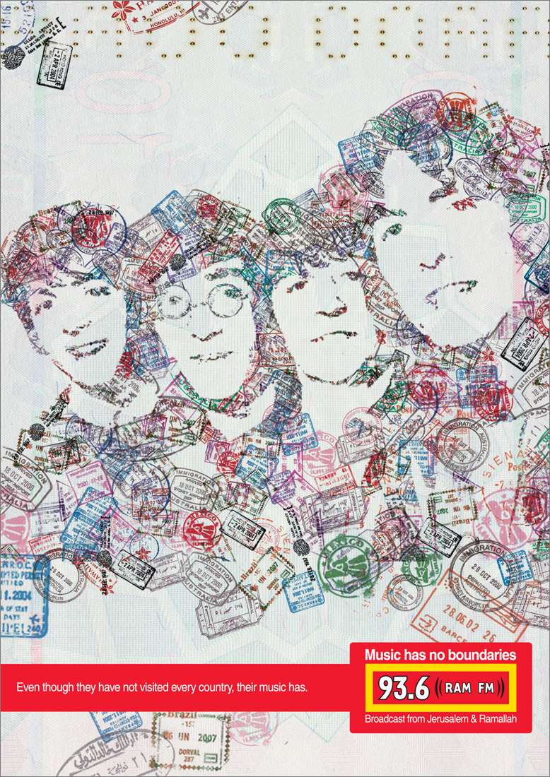
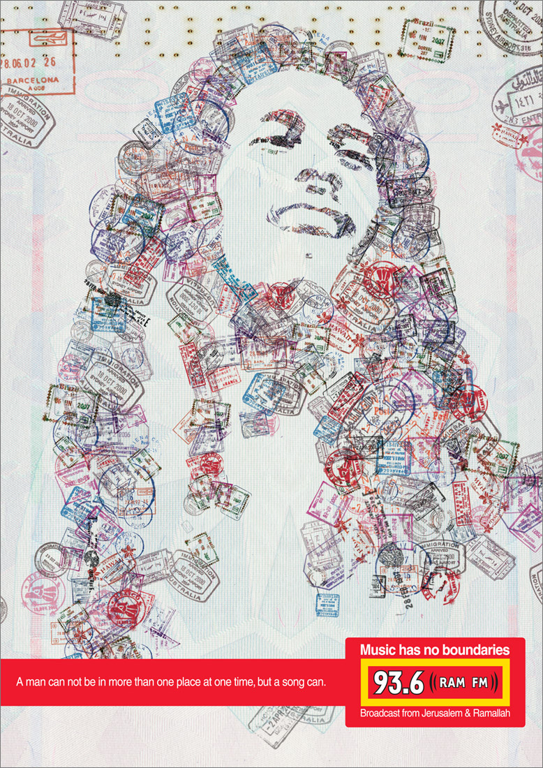
14: creative
A couple of advertisements for a radio station. Ram FM 93.6 is a Palestinian and Israeli Radio station that broadcast from Jerusalem and Ramallah. Their aim is to create a bridge between the two nations through music.
Music has no boundaries...

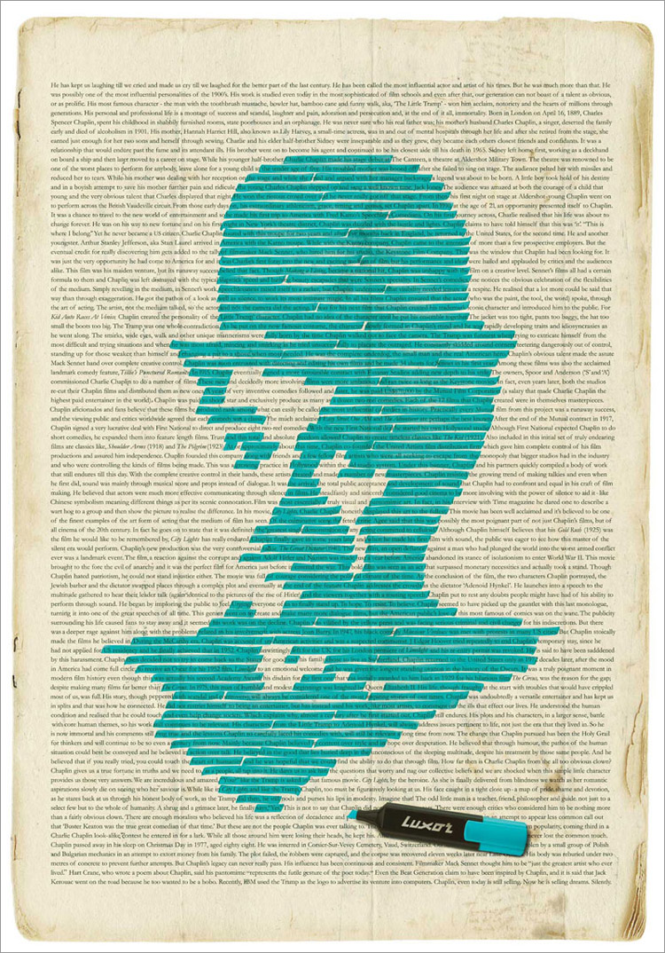
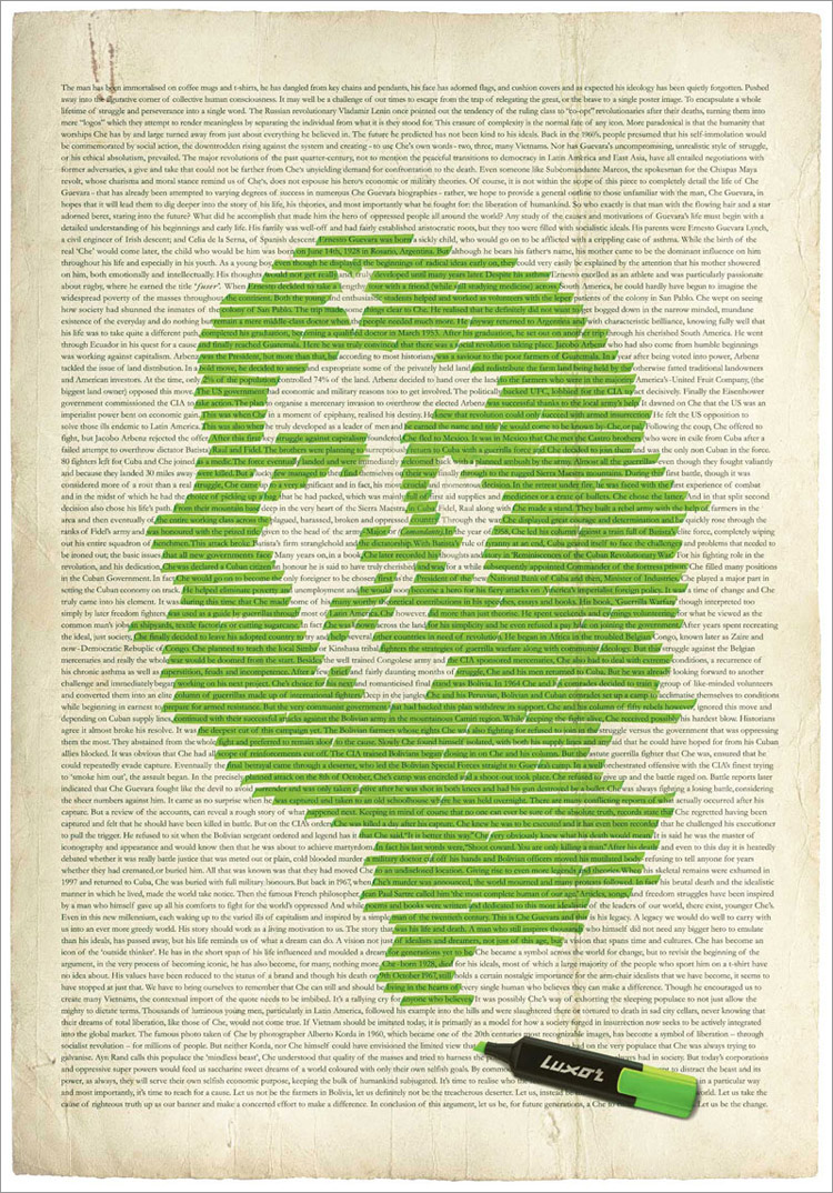
Luxor Highlighter Advertisement:

Thursday, March 13, 2008
13: Quirky
An amazingly quirky hat created by Vik Prjónsdóttir in Iceland.
Now that is function + personality:
Natasha’s Baby Doll Coat Rack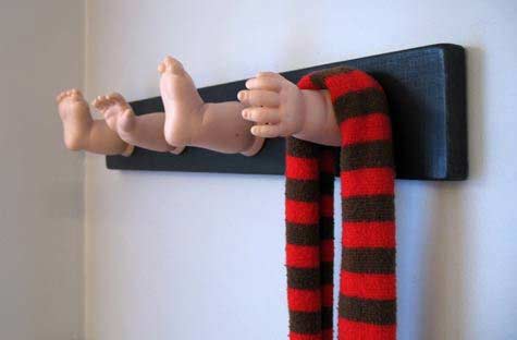
Stomp
The idea here is that most people are going to throw their butts on the floor anyway and then step on the them put them out (hopefully), so why not have form follow function and create an ashtray that works with smokers instead of against them? It's made of mortar in a steel casing so this thing is going to last a long time too. Probably longer than your lungs if you're a smoker ;) Will run you $55.

Wednesday, March 12, 2008
12: A sketchbook history
I'm always curious at what an illustrator's sketchbook would look like comparing from when they first start out drawing until present. It's nice to see the development and improvements they have made over the years. Also, it's encouraging to see that even professionals today had to start from the very basics and began with creating artworks that would probably make them cringe nowadays. The illustrator, Dani Jones, shares his personal sketchbook with the world. It documents his creative journey from the age of 12 through to 24.
100 pages. Twelve years in the making.
I wanted to digitally archive some of my old drawings, and it turned into a huge sketchbook scanning bash. In this post, I’ve collected 100 pages and laid them out chronologically. It was a great project, and I ended up learning a lot; it’s probably more fun for me than for you, because I get to walk down memory lane a bit, but hopefully you’ll gain something from my little experiment.
click here to view his sketchbook


Tuesday, March 11, 2008
11: Blank Catalogue
In any printed matter, the text and graphics are always the center of attention. Their aim is to provide you with information and visual stimulation. So it is not surprising that little of the backgrounds is registered in the brain. But the backgrounds cannot be overlooked because they do play a very essential role in a any layouts: they section off nuggets of information where necessary; they unify a layout and make an otherwise stark design stand out.
Today I came across a project that puts the spotlight on the background:


Created by Jason Salavon, "[t]his suite of ten prints abstracts selected facing-page layouts from the 2007 IKEA catalogue based upon the original page design, leaving only color and structure." He has also created a large light box, as shown above, that contains "all 374 pages of the 2007 IKEA catalogue, each simplified to a rectangle of pure color and arranged them left-to-right, top-to-bottom."
http://www.siongchin.com/blog/
Sunday, March 9, 2008
10: Youth for Human Rights
Youth for Human Rights International presents 30 powerful and emotional public service announcements promoting the human rights protected by the United Nations Universal Declaration of Human Rights. Used to promote the Human Rights and Empower youth to step up and take action!
I noticed while watching these, that some of the videos focused just on the positives of the topic, whereas others dealt with the more negative aspects of the topic. The imagery, music and colors used in these videos worked wonderfully in setting the mood and delivering the message.
#29: Our Responsibilities.
#1: We are all born free and equal
#4: No Slavery
#5: No Torture
#28: A Fair & Free World
#15: A Right to a Nationality
http://www.youtube.com/watch?v=7Ds85u7a0NM
#18: Freedom of Thought
http://www.youtube.com/watch?v=VyikimSR_4E
#19: Freedom of Expression
http://www.youtube.com/watch?v=Y37zD6a1g1I
Friday, March 7, 2008
09: CSS Resources
CSS Resources PDF
"I've assembled all my CSS resources in this handy PDF file and instead of keeping it for myself I'm sharing this with the rest of the community. The table of contents is linked too, so if you click "learning" for example you're off to the right page. There 6 pages of web links defined in categories like:
- Learning
- CSS Layout resources
- Positioning
- List Styling
- Font Styling
- Navigation
- Forms in CSS
- CSS Guides
- Image Techniques
- Image Replacement
- CSS Showcases
- CSS Bug Fix Resources
- CSS Tools
- Validation
- Recommended reading
Wednesday, March 5, 2008
08: BAM!
A site I came across a while back.
Before & After magazine has been sharing its practical approach to graphic design since 1990. Because our modern world has made designers of us all (ready or not), Before & After is dedicated to making graphic design understandable, useful and even fun for everyone.
http://www.bamagazine.com/
Monday, March 3, 2008
06: work in progress
So here are my three concepts for the project.![]() #1: So this logo features two people, who are connected together through a single stroke. This is to represent the fact that we are all connected through a common goal; that by fighting for someone else's rights we are in turn fighting for our own rights as well. I've purposely used a gradient to represent the different blends of people.
#1: So this logo features two people, who are connected together through a single stroke. This is to represent the fact that we are all connected through a common goal; that by fighting for someone else's rights we are in turn fighting for our own rights as well. I've purposely used a gradient to represent the different blends of people.![]() #2: There are many connotations associated with "hands", that I find is especially relevant to the aim of the HRAFF organization in promoting the issue of human rights. The right hand is usually used to represent truth and doing what is right. It can also mean "lending a hand" and "reaching out" in helping others and promoting what is right.
#2: There are many connotations associated with "hands", that I find is especially relevant to the aim of the HRAFF organization in promoting the issue of human rights. The right hand is usually used to represent truth and doing what is right. It can also mean "lending a hand" and "reaching out" in helping others and promoting what is right.![]() #3: After a good few minutes staring at the words "Human Rights", I noticed the 'u' and 'i' in the words. The human rights issue is something that involves not only victims from third world countries but every one of us; you and I. That was essentially the idea behind this logo, however I had some trouble trying to represent that graphically.
#3: After a good few minutes staring at the words "Human Rights", I noticed the 'u' and 'i' in the words. The human rights issue is something that involves not only victims from third world countries but every one of us; you and I. That was essentially the idea behind this logo, however I had some trouble trying to represent that graphically.
Sunday, March 2, 2008
05: design trends of 2008
Interesting article from 'Computer Arts' website, where they interviewed some top designers for their predictions regarding 2008 design trends.
http://www.computerarts.co.uk/in_depth/features/trends_2008
Saturday, March 1, 2008
04: color schemes
Here are some great color sites that I came across that you may or may not already know of.
adobe: kuler
wellstyled: color generator 2
colour lovers
Subscribe to:
Posts (Atom)