
What is the face of London, New York, Paris? What does a Londoner, a New Yorker, a Parisian look like?
The Face of Tomorrow is a concept for a series of photographs that addresses the effects of globalization on identity.
The large metropolises of the world are magnets for migrants from all parts of the planet resulting in new mixtures of peoples. What might a typical inhabitant of this new metropolis look like in one or two hundred years if they were to become more integrated?
In Turkey and particularly in Istanbul, situated as it is at the crossroads of Europe and Asia, of the Mediterranean and the Black Sea, you can see how this process has been at work over the last thousand years as waves of humanity from Central Asia, Arabia, Greece and Rome have been absorbed. The resulting population is fairly uniform suggesting that if you could combine all the faces in a city right now you would be looking at the future face of that city.
The Face of Tomorrow attempts to find this face by taking photographs of the current inhabitants and compositing their faces to create a typical face. What we get is a new person - a mix of all the people in that city. A face that doesn't exist right now, but a face, it seems, of someone quite real the Face of Tomorrow.
Friday, July 18, 2008
the face of tomorrow
Wednesday, July 16, 2008
studios
http://www.studiobrave.com.au/home.html
http://www.sassendesign.com.au
http://www.twamdesign.com/work/mint.html
Saturday, June 14, 2008
Newsmap
 http://marumushi.com/apps/newsmap/newsmap.cfm
Newsmap is an application that visually reflects the constantly changing landscape of the Google News news aggregator. A treemap visualization algorithm helps display the enormous amount of information gathered by the aggregator. Treemaps are traditionally space-constrained visualizations of information. Newsmap's objective takes that goal a step further and provides a tool to divide information into quickly recognizable bands which, when presented together, reveal underlying patterns in news reporting across cultures and within news segments in constant change around the globe. Its objective is to simply demonstrate visually the relationships between data and the unseen patterns in news media. It is not thought to display an unbiased view of the news; on the contrary, it is thought to ironically accentuate the bias of it.
Tuesday, May 27, 2008
31: Using Twitter
Double posting. The incorporated use of twitter this week in one of the mini projects was really interesting. So I did some browsing online about using Twitter and came across some other existing projects that use it. http://twistori.com/
Twistori is a real time visualizer that pulls and displays tweets that contain the words love, hate, think, believe, feel and wish. It works really well because it's visually outstanding. www.twittervision.com
a Twitter visualization website built with the Twitter API, using location data from Twittermap (a Twitter/Google Maps Mashup). What's really cool is that you can zoom right in to to see what street people are posting from.
30: We Feel Fine
Really interesting site I stumbled across using stumbleupon.

We Feel Fine is an exploration of human emotion on a global scale.
Since August 2005, We Feel Fine has been harvesting human feelings from a large number of weblogs. Every few minutes, the system searches the world's newly posted blog entries for occurrences of the phrases "I feel" and "I am feeling". When it finds such a phrase, it records the full sentence, up to the period, and identifies the "feeling" expressed in that sentence (e.g. sad, happy, depressed, etc.). Because blogs are structured in largely standard ways, the age, gender, and geographical location of the author can often be extracted and saved along with the sentence, as can the local weather conditions at the time the sentence was written. All of this information is saved.
The result is a database of several million human feelings, increasing by 15,000 - 20,000 new feelings per day. Using a series of playful interfaces, the feelings can be searched and sorted across a number of demographic slices, offering responses to specific questions like: do Europeans feel sad more often than Americans? Do women feel fat more often than men? Does rainy weather affect how we feel? What are the most representative feelings of female New Yorkers in their 20s? What do people feel right now in Baghdad? What were people feeling on Valentine's Day? Which are the happiest cities in the world? The saddest? And so on.
At its core, We Feel Fine is an artwork authored by everyone. It will grow and change as we grow and change, reflecting what's on our blogs, what's in our hearts, what's in our minds. We hope it makes the world seem a little smaller, and we hope it helps people see beauty in the everyday ups and downs of life.
Tuesday, May 20, 2008
29: Click, Click, Click, Click
"Click, Click, Click, Click" by Bishop Allen from the album The Broken String on Dead Oceans. Directed by Randy Bell. Love the music video!
Tuesday, May 13, 2008
28: Spirituality & Japanese Design Practice
Excerpts from the article I found interesting:
The Japanese have demonstrated a rare syncretic genius in learning how to borrow and adapt from their own culture and elsewhere, and then to retool these materials into something uniquely theirs.
The Japanese don’t see emptiness as synonymous with infertility or barrenness as we tend to perceive it. Instead, nothingness is that from which form can emerge. The painters of Japan believed that emptiness was apparent as a context only after the first well conceived stroke was put to paper. What might seem like an inconsequential difference actually structures an entire people’s appreciation of meaningful presence. Emptiness to us, by any other name, plays a procreative role in Japan and, through its subtle mastery, achieves meaningful presence. A similar appreciation can be seen in design theory, such as in Alex W. White’s Thinking in Type: “The spaces surrounding and within letters are as significant and the letters themselves. In fact, the shapes around the letters define the letters. Managing the spaces between and around letters makes type more or less legible.” A simple context taken outside of the constraints of language can allow for a deeper understanding of typography, architecture, or one’s spiritual journey.
Read the full article here: http://www.aiga.org/content.cfm/spirituality-and-japanese-design-practise
Friday, May 9, 2008
27: ABC Pop-Up Craziness
Coolest pop up book i've ever seen. Very clever. By French graphic designer Marion Bataille.
Thursday, May 1, 2008
26: The Break-Up
The Break-Up' is about the relationship between an advertiser and a consumer. They've agreed to meet in a restaurant. The man's feeling perfectly happy, until the woman makes a painful announcement: she wants a divorce. In the course of their conversation she makes it clear to him why she is leaving him. And he makes it very clear that he doesn't have an empathic bone in his body. At the end of the movie the woman walks away disappointed but determined. The advertiser stays behind alone.
Microsoft Digital Advertising Solutions wanted to make this movie because: “We want to try and tell that digital media is not about technology but about quality of communication, about the interaction between 2 people. There is no better medium than a movie to symbolize the one-to-one communication between people, in this case between an advertiser and a consumer.”
“We wanted to do this movie to really debate with our partners and marketers the changing relationship between advertisers and consumers. We are always discussing the changing media landscapes, how consumers have changed and how advertisers need to redefine how they connect with them and we wanted to really bring the subject to life and walk the walk in terms of new ways of connecting. We want to be able to use the movie online but also at every point in face-to-face interactions with our customers to open up conversations about how media is changing and of course we then want to go on to discuss how we can partner with them in this area."
http://bringtheloveback.com
Wednesday, April 30, 2008
26: Doll


I drew this while coming up with different ideas for the postcard designs.
I first started off just drawing a face, using pencil. Which I am kinda happy with how it turned out. The idea was that I would create a series of dolls with the same face, but different hairstyles. I drew the different hair designs onto tracing paper, which I scanned in and then traced using Illustrator. I particularly liked how this doll turned out; I decided not to vectorize the face, since I like the texture it gives the eyes from the pencil... I think I might make this into a series of cards in future.
Thursday, April 24, 2008


Wednesday, April 23, 2008
24: Collages

This image was created by Australian artist, Andrea Smith. Featured in the fourth edition of Curvy. It uses a lot of different materials, layering and collaging them together to form a picture of a female. It's brilliant! I really like this style of artwork and also the 'hands on' experience of actually physically creating an art piece.
Tuesday, April 15, 2008
23: Black Sharpie Pen + White Shiny Lamborghini
The car was done in sharpie markers on the paint and then finished with a clear coat for protection. It took about 2 weeks total.


Thursday, April 10, 2008
22: coffee kiss

Amazing!
The pottery, named Yuanyang II, is one of the collections of Hong Kong Museum of Art now displaying at the Central Concourse of Hong Kong International Airport (HKIA). It is produced by Tsang Cheung-shing, a ceramic art tutor and product designer.
Yuanyang II is modeled in a distinctive form with two figures indulged in kissing each other. Their heads support two elegant cups for drinking tea and coffee. The form and concept design fully complement the theme “Yuanyang” (a typical Hong Kong beverage of mixing tea and coffee), a symbol of marriage and love, with a touch of humour for artistic creation.
Coffee, anyone?
Monday, April 7, 2008
21: Semi Permanent 2008
 Got on a plane to Sydney last Thursday to attend my first Semi Permanent design event. Despite the fact that I am now broke, plus long delays at the airport and feeling unwell on my way up to Sydney, overall I'm really glad that I decided to go.
Semi Permanent was an excellent source of inspiration for me. It was interesting to hear these speakers - who are at the top of their respective fields - share with everyone their experience and expertise that they have gained getting to that position. I especially found it fascinating to see the variety of techniques/styles that were explored and the different methods they used to in approaching their art/designs.
So the conference consisted of the speakers partly talking about how they went about doing their work, the thought processes behind their work and mostly showcases of their work. These are a few brief memorable points from the event that I particularly liked.
Day 1:
Life Lounge mentioned an interesting philosophy of theirs about the using the Cheap/Good/Fast pricing structure when trying to price a job. Choose only two of the three things mentioned and that is how you should price your job based on those things. For example, if a client wants a good product fast, obviously you will charge a lot more. If a client wants a good product for cheap, chances are it’s not going to be fast. If a client wants a fast product for cheap then chances are it is not going to be good. Prices should be based around this structure.
What I really liked about Debaser was the fact that they actually made models of or recreated actual scenes instead of just using and relying on Photoshop. The swamp was bloody awesome!
Oh, and Sixty40 were awesome too! Another presentation that I found myself really captivated by was by the speaker, Spencer Platt. His photographs are confronting, yet disturbingly beautiful. I liked how he described photographs in comparison to the moving image as being like semicolons within a sentence; they force you stop, step back and take a breathe.
Day 2:
It was really nice to learn about the background of the speaker, Alex Trochut. Seeing his grandfather's modular system, sketches and experimentations was really interesting. You could really see how much his grandfather had played a huge influence in his life and how he drew upon what he learned from his grandfather in his practice. Alex's work is just insane, especially the Nike 'Momentum' poster he did. I actually learned a lot from his presentation, in regards to process and methods of working. I liked how he said that each time he works, he draws upon things he had learned from other projects; they are all interrelated. Gradually you build upon these skills, which will then lead you to new projects that enable you to use what you have learned.  Another outstanding speaker, was Pixar's Andrew Gordon. But that was already expected. It was amazing seeing the amount of research that goes into making a film. I found it particularly interesting to hear about how Pixar functioned as a team. He mentioned how they don't intentionally choose anyone to be the 'leader' of a particular character. Naturally, the person who becomes the unofficial leader of the character can be seen by the amount of work they put into the character. I also wonder how Toy Story 3 will turn out...
Conclusion:
About 10 of the 12 speakers, I found to be truly inspiring. I have narrowed down my favorite speakers to Alex Trochut and Pixar. Overall, it was extremely entertaining, and the work was just totally unreal and inspirational. Now that I've thought it over and blogged about it, I would give the 2 day conference a good 8/10. Hopefully I'll be attending again next year.
Sunday, March 30, 2008
Thursday, March 27, 2008
19: Farewell Polaroid..

The era of the iconic Polaroid Instant Film has come to end. In a day when nearly every cellphone has a digital camera in it, “instant” photography long ago stopped being instant enough for most people.
Due to marketplace conditions, Polaroid has discontinued almost all of its instant analog hardware products. Polaroid has also made the difficult decision to cease manufacturing of instant film products in 2008. http://www.polaroid.com/ifilm/en/index.html
On February 8, 2008, Polaroid Corporation announced it would cease production of all instant film; the company will shut down three factories and lay off 450 workers.
Support the petition:
http://www.savepolaroid.com/
http://www.flickr.com/groups/savepolaroid
I've been a huge fan of Polaroids ever since I found one hidden away in a closet at home. My father bought it years ago, but never used it. I love it. So it's sad news that they are abandoning such a wonderful method of image-making. I like the simplicity of using Polaroids, in comparison to digital cameras. The self-contained photograph may be flawed, but it's the beauty of these imperfections that make it so special. They have personality and character, serving many as a hard copy of their memories, something to hold onto, something which in many years to come people can look back at and smile.
The Polaroid moment is one of a kind, an original every time.
 (Photo by cloci)
Wednesday, March 26, 2008
18: Matt Stuart frames strangers
Matt Stuart is a professional photographer from England. He is fascinated about people and the way they live their lives. But what is really interesting is that Matt shoots photos from perspectives which create an illusion of objects and situations that don’t exist in reality. In each photo Matt presents human life from unique perspectives, and thus tries to make an honest picture which people know immediately is a genuine moment and which hopefully burrows deep into their memories.
I really enjoy viewing his photos. He has an amazing ability to take a moment of mundane life and present it in a totally refreshing way. Also the precision of his shots are just so brilliant.


Wednesday, March 19, 2008
17: The burgers are coming to kick your arse
It's past 1am and I'm really bored, so I'm going to double post...
While youtubing, I came across this awesome stop animation short film by Stefan Nadelman.
It has burgers, pretzels, sausages and so on, fighting it out to rule the world. It's basically a history of war since World War II - the Germans invading everywhere, Pearl Harbour, Hiroshima, the Cold War, the Palestinian/Israeli conflict, September 11th, and the war in Iraq.
It reminded me a little of the Jan Švankmajer's work "Dimensions of Dialogue" that was shown during the Monday morning class.
If you have trouble figuring out what is who in the video (like me).. here is the "cheat sheet" and break down of the events shown.
what is who & the battle
16: huidletters
Following on from my previous post on letters, I stumbled across this...
The Netherlands' Thijs Verbeek finds an interesting but gross way of spelling out the alphabet.
Ouch? =/ Click here for more! (you know you want to...)
Tuesday, March 18, 2008
Friday, March 14, 2008
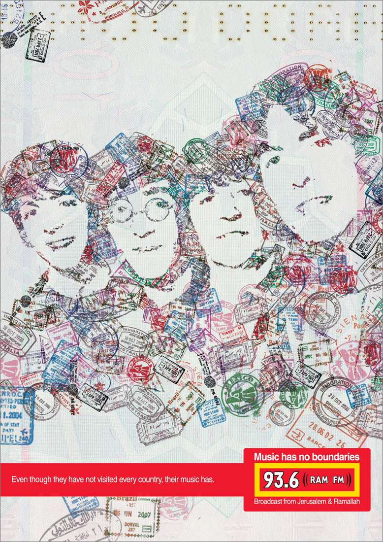
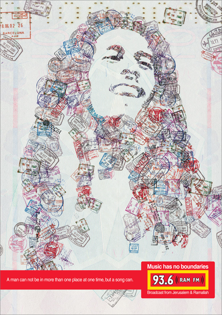
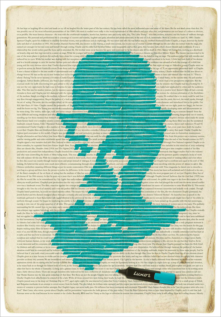
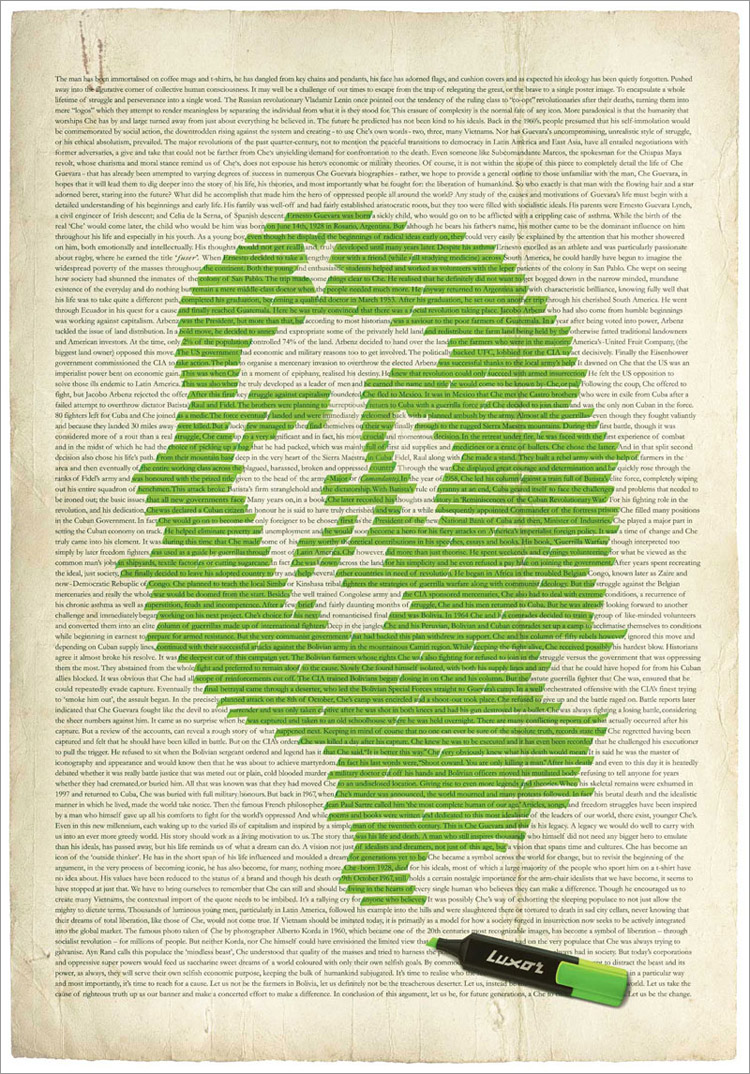
14: creative
A couple of advertisements for a radio station. Ram FM 93.6 is a Palestinian and Israeli Radio station that broadcast from Jerusalem and Ramallah. Their aim is to create a bridge between the two nations through music.
Music has no boundaries...

Luxor Highlighter Advertisement:

Thursday, March 13, 2008
13: Quirky
An amazingly quirky hat created by Vik Prjónsdóttir in Iceland.
Now that is function + personality:
Natasha’s Baby Doll Coat Rack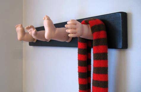
Stomp
The idea here is that most people are going to throw their butts on the floor anyway and then step on the them put them out (hopefully), so why not have form follow function and create an ashtray that works with smokers instead of against them? It's made of mortar in a steel casing so this thing is going to last a long time too. Probably longer than your lungs if you're a smoker ;) Will run you $55.

Wednesday, March 12, 2008
12: A sketchbook history
I'm always curious at what an illustrator's sketchbook would look like comparing from when they first start out drawing until present. It's nice to see the development and improvements they have made over the years. Also, it's encouraging to see that even professionals today had to start from the very basics and began with creating artworks that would probably make them cringe nowadays. The illustrator, Dani Jones, shares his personal sketchbook with the world. It documents his creative journey from the age of 12 through to 24.
100 pages. Twelve years in the making.
I wanted to digitally archive some of my old drawings, and it turned into a huge sketchbook scanning bash. In this post, I’ve collected 100 pages and laid them out chronologically. It was a great project, and I ended up learning a lot; it’s probably more fun for me than for you, because I get to walk down memory lane a bit, but hopefully you’ll gain something from my little experiment.
click here to view his sketchbook


Tuesday, March 11, 2008
11: Blank Catalogue
In any printed matter, the text and graphics are always the center of attention. Their aim is to provide you with information and visual stimulation. So it is not surprising that little of the backgrounds is registered in the brain. But the backgrounds cannot be overlooked because they do play a very essential role in a any layouts: they section off nuggets of information where necessary; they unify a layout and make an otherwise stark design stand out.
Today I came across a project that puts the spotlight on the background:


Created by Jason Salavon, "[t]his suite of ten prints abstracts selected facing-page layouts from the 2007 IKEA catalogue based upon the original page design, leaving only color and structure." He has also created a large light box, as shown above, that contains "all 374 pages of the 2007 IKEA catalogue, each simplified to a rectangle of pure color and arranged them left-to-right, top-to-bottom."
http://www.siongchin.com/blog/